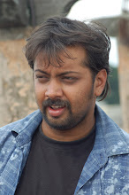
Twas raining like hell in chennai where we were doing the final mastering of naod's audio some time back... I just wanted to get done with it and take back the audio outta there as soon as possible and move on!!Twas kinda deadline for me too.... and amidst all this chennai confusion...one happy memory for me was meeting this guy SATYA --who mixed the audio...
There was a particular style for every song that we had planned out...in the way it should sound..and while we were thinking abt what should be heard how...this guy asked me...
'What is the colour template in which u are shooting or have shot the song?" Why ? I asked.
He so clearly explained to me that based on the colour of my songs..he would mix and add filters...to the audio... the sound has to go with the colour of the visual ' he said.SO TRUE...
Sunday, October 26, 2008
Subscribe to:
Post Comments (Atom)

1 comment:
That's great!! Good that you met somebody who has the same wavelenght, attitude and quality consciousness as yours!!... Thanks to SATYA...!!
Today... I saw the AD of NAOD saying 'Audio releasing shortly' ....
The AD is cute with the lead pair standing besides each other.... Their outfit is causual and looks good...!!
I have a few suggestions .... Somehow the idea of showing the title in a faded manner didn't appeal me... In fact, while reading the paper for the first time, I missed seeing this NAOD AD... Later, when I was browsing the paper for the second time, I was surprised to see NAOD AD....
I feel the title and the background grey shade should become DARK like how the trailer looks.... That gives a special attraction to the AD... Now, it does not look like a FILM AD.... It looks like some product AD and there is a danger that it might not attract reader's attention....
Also, except for the tag line 'magaa ... lov... id local saaraayi kicku' portion... please remove the wordings which look like hand written .... It makes the AD shobby...
I mean what I am referring to are the following wordings like
1. Sri Lakshmi Sai Bhairaveshwara films ravara.... shri.. t.p siddaraju....
2) ellarigoo deepaavaLi habbada shubhaashayagaLu...
3) ashok kashyap, arjun, aanand, .. etc.., etc.,
The concept of having the feel like hand written wordings is good... But, it didn't appeal to me at least....
I would like to see the logo 'An arvind kaushik film' as displayed at the end of the first trailer...
My suggestion would be... Let the title, background grey shade and other wordings be in dark color and the let the characters (hero, heroine etc.,) be shown in the background with a light shade....
These are my few cents.... Please ignore if not found suitable...
Post a Comment